Sunday, January 18, 2015

Move an element with a soft effect CSS.

<style type="text/css">

    #mob-home-btn {
        width: 150px;
        height: 20px;
        text-align: center;
        font-family: verdana;
        line-height: 20px;
        background-color: magenta;
       
    }
    #superDiv {
        width: 150px;
        height: 100px;
        background-color: #272727;
        transition: margin-top 1s;
    }
    #mob-home-btn:hover + #superDiv {
        margin-top: 150px;
    }

</style>


<div id="mob-home-btn">Hover Over Me</div>
<div id="superDiv"></div>


Output :)

1)

2)

Saturday, January 17, 2015

Apply similar Fill Effect with SVG icons CSS.

<style type="text/css">

body {
   background: #33b5e5;
}
.st0 {
   fill:none;
   stroke:#F2F2F2;
   stroke-width:4;
   stroke-miterlimit:10;
}
.icon .st0 {
   -webkit-transition: .5s;
   transition: .5s;
}
.icon .fill {
   -webkit-transition: .5s;
   transition: .5s;
   fill: #ffffff;
}
.icon:hover {
   cursor: pointer;
}
.icon:hover .st0 {
   stroke: red;
}
.icon:hover .fill {
   -webkit-transform: scale(893, 893);
   transform: scale(893, 893);
}

</style>


<svg version="1.1" xmlns="http://www.w3.org/2000/svg" xmlns:xlink="http://www.w3.org/1999/xlink" x="0px" y="0px" width="150px" height="150px" viewBox="0 0 200 200" style="enable-background:new 0 0 200 200;" xml:space="preserve" class="icon">
    <g transform="translate(101,99)">
        <circle class="fill" r="0.1" />
    </g>
    <g class="container">
        <circle class="st0" cx="101" cy="99" r="89.333" />
    </g>
    <g class="icon-details">
        <path class="st0" d="M146.899,134.202c3.856,4.702,2.772,11.963-2.418,16.218l0,0c-5.192,4.258-12.523,3.896-16.38-0.806
l-30.004-36.594c-3.855-4.701-2.772-11.964,2.418-16.22l0,0c5.19-4.256,12.523-3.895,16.377,0.808L146.899,134.202z" />
        <circle class="st0" cx="77.843" cy="72.434" r="33.331" />
        <circle class="st0" cx="77.844" cy="72.434" r="22.343" />
    </g>
</svg>
<svg version="1.1" xmlns="http://www.w3.org/2000/svg" xmlns:xlink="http://www.w3.org/1999/xlink" x="0px" y="0px" width="150px" height="150px" viewBox="0 0 200 200" style="enable-background:new 0 0 200 200;" xml:space="preserve" class="icon">
    <g transform="translate(101,99)">
        <circle class="fill" r="0.1" />
    </g>
    <g class="Layer_1">
        <path class="st0" d="M247,180" />
    </g>
    <g class="icon_1_">
        <rect class="st0" x="45.25" y="71.5" class="st1" width="111.5" height="58" />
        <polyline class="st0" points="45.25,74.167 101,101.167 156.75,73.5 " />
    </g>
    <g class="container">
        <circle class="st0" cx="101" cy="99" r="89.333" />
    </g>
</svg>
<svg version="1.1" xmlns="http://www.w3.org/2000/svg" xmlns:xlink="http://www.w3.org/1999/xlink" x="0px" y="0px" width="150px" height="150px" viewBox="0 0 200 200" style="enable-background:new 0 0 200 200;" xml:space="preserve" class="icon">
    <g transform="translate(101,99)">
        <circle class="fill" r="0.1" />
    </g>
    <g class="Layer_1" class="st5">
        <path class="h0" d="M247,180" />
    </g>
    <g class="icon_2_">
        <path class="st0" d="M155.5,70.5c0,5.799-4.701,10.5-10.5,10.5H55.5C49.701,81,45,76.299,45,70.5l0,0C45,64.701,49.701,60,55.5,60
H145C150.799,60,155.5,64.701,155.5,70.5L155.5,70.5z" />
        <path class="st0" d="M155.5,100.5c0,5.799-4.701,10.5-10.5,10.5H55.5c-5.799,0-10.5-4.701-10.5-10.5l0,0
C45,94.701,49.701,90,55.5,90H145C150.799,90,155.5,94.701,155.5,100.5L155.5,100.5z" />
        <path class="st0" d="M155.5,130.5c0,5.799-4.701,10.5-10.5,10.5H55.5c-5.799,0-10.5-4.701-10.5-10.5l0,0
c0-5.799,4.701-10.5,10.5-10.5H145C150.799,120,155.5,124.701,155.5,130.5L155.5,130.5z" />
    </g>

    <g class="container">
        <circle class="st0" cx="101" cy="99" r="89.333" />
    </g>
</svg>


Output :)

1)

2)

Friday, January 16, 2015

Nice Hover Effects on Button CSS.

<style type="text/css">

button{
background: #3a7999;
border: none;
color: #f2f2f2;
padding: 10px;
font-size: 18px;
border-radius: 5px;
position: relative;
box-sizing: border-box;
transition: all 500ms ease;
}

.b1:before{
content: "";
position: absolute;
top: 0;
left: 0;
width: 0px;
height: 42px;
background: rgba(255,255,255,0.3);
border-radius: 5px;
transition: all 2s ease;
}

.b1:Hover:before{
width: 100%;
}

.b2:before{
content: "";
position: absolute;
top: 0;
left: 0;
width: 100%;
height: 0;
background: rgba(255,255,255,0.3);
border-radius: 5px;
transition: all 2s ease;
}

.b2:Hover:before{
height: 42px;
}

.b3:Hover{
background: rgba(0,0,0,0);
color: #3a7999;
box-shadow: inset 0 0 0 3px #3a7999;
}

@-webkit-keyframes bounce{
0%, 20%, 60%, 100%{
-webkit-transform: translateY(0);
transform: translateY(0);
}
40%{
-webkit-transform: translateY(-20px);
transform: translateY(-20px);
}
80%{
-webkit-transform: translateY(-10px);
transform: translateY(-10px);
}
}

.b4:Hover{
-webkit-animation: bounce 1s;
}

.b5:Hover{
transform: skew(-10deg);
}

.b6{
transform-style: preserve- 3d;
}

.b6:after{
top: -100px;
left: 0px;
width: 100%;
position: absolute;
background: #3a7999;
border-radius: 5px;
content: "Flipped";
transforn-origin: left bottom;
transform: rotateX(90deg);
}

.b6:hover{
transform-origin: center bottom;
transform: rotateX(-90deg) translateY(100%);
}

</style>

<button class="b1">Hover Me</button>
<button class="b2">Hover Me</button>
<button class="b3">Hover Me</button>
<button class="b4">Hover Me</button>
<button class="b5">Hover Me</button>
<button class="b6">Hover Me</button>


Output :)


Tuesday, January 13, 2015

Animated text within box CSS.

<style type="text/css">

.animated-box {
border:3px solid #33b5e5;
border-radius: 30px 0;
color: #3300bb;
font-size: 25px;
font-family: verdana;
line-height:20px;
font-weight:bold;
text-align:center;
padding:50px;
width:200px;

-webkit-animation:fontbulger 1s infinite;
-moz-animation:   fontbulger 1s infinite;
-o-animation:     fontbulger 1s infinite;
animation:        fontbulger 1s infinite;
}

@-webkit-keyframes fontbulger {
 0%, 100% {
font-size: 15px;
 }
 50% {
font-size: 25px;
 }
}
@-moz-keyframes fontbulger {
 0%, 100% {
font-size: 15px;
 }
 50% {
font-size: 25px;
 }
}
@-o-keyframes fontbulger {
 0%, 100% {
font-size: 15px;
 }
 50% {
font-size: 25px;
 }
}
@keyframes fontbulger {
 0%, 100% {
font-size: 15px;
 }
 50% {
font-size: 25px;
 }
}

</style>

<div class="animated-box">CSS jQuery</div>


Output :)

1)

2)

Text Stroke CSS.

<html>
<head>
<title>Text Stroke</title>
<style type="text/css">

h1 {
-webkit-text-stroke: 2px red;
-moz-text-stroke: 2px red;
-o-text-stroke: 2px red;
text-stroke: 2px red;
color: white;
font-size: 200px;
font-family: forte;
}

</style>
</head>
<body>
<h1>MaHii</h1>
</body>
</html>


Output :)


Monday, January 12, 2015

Adding radius in center of div not corner CSS.

<style type="text/css">

body {
margin: 0;
}
.zone-wrapper{
background: #ddd888;
height:180px;
}
.content {
top: -90px;
position: relative;
height: 800px;
background-color: #33b5e5;
border-top-left-radius: 4000px 150px;
border-top-right-radius: 4000px 150px;
z-index: 1;
}
.seperator {
height: 50px;
background-color: black;
border-top-left-radius: 4000px 150px;
border-top-right-radius: 4000px 150px;
top: -47px;
width: 100%;
position: relative;
z-index: 1;
}

</style>

<div id="zone-user-wrapper" class="zone-wrapper"></div>
<div class="seperator"></div>
<div class="content"></div>


Output :)


Sunday, January 11, 2015

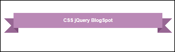
Ribbon CSS.

<style>

body {
padding:2.618em;
font-family:sans-serif;      
}
.ribbon {
font-size: 16px !important;
position: relative;
background: #ba89b6;
color: #fff;
text-align: center;
padding: 1em 2em;
margin: 0 0 3em;
}
.ribbon:before, .ribbon:after {
content: "";
position: absolute;
display: block;
bottom: -1em;
border: 1.5em solid #986794;
z-index: -1;
}
.ribbon:before {
left: -2em;
border-right-width: 1.5em;
border-left-color: transparent;
}
.ribbon:after {
right: -2em;
border-left-width: 1.5em;
border-right-color: transparent;
}
.ribbon .ribbon-content:before, .ribbon .ribbon-content:after {
content: "";
position: absolute;
display: block;
border-style: solid;
border-color: #804f7c transparent transparent transparent;
bottom: -1em;
}
.ribbon .ribbon-content:before {
left: 0;
border-width: 1em 0 0 1em;
}
.ribbon .ribbon-content:after {
right: 0;
border-width: 1em 1em 0 0;
}

</style>

<p class="ribbon">
    <strong class="ribbon-content">CSS jQuery BlogSpot</strong>
</p>


Output :)